
- Trending Categories
 Data Structure
 Networking
 RDBMS
RDBMS Operating System
 Java
Java MS Excel
 iOS
iOS HTML
HTML CSS
CSS Android
 Python
 C Programming
 C++
C++ C#
C# MongoDB
 MySQL
MySQL Javascript
 PHP
PHP Physics
 Chemistry
 Biology
 Mathematics
 English
 Economics
 Psychology
 Social Studies
 Fashion Studies
 Legal Studies
- Selected Reading
- UPSC IAS Exams Notes
- Developer's Best Practices
- Questions and Answers
- Effective Resume Writing
- HR Interview Questions
- Computer Glossary
- Who is Who
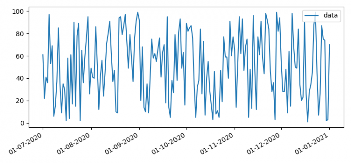
How to change the datetime tick label frequency for Matplotlib plots?
To change the datetime tick label frequency for Matplotlib plots, we can create a dataframe and plot them in some date range
Steps
- Set the figure size and adjust the padding between and around the subplots.
- To make potentially heterogeneous tabular data, use Pandas dataframe.
- Plot the dataframe using plot() method.
- Set X-axis major locator, i.e., ticks.
- Set X-axis major formatter, i.e., tick labels.
- Use autofmt_xdate(). Date ticklabels often overlap, so it is useful to rotate them and right align them.
- To display the figure, use show() method.
Example
import pandas as pd
import numpy as np

import matplotlib.pyplot as plt
import matplotlib.dates as mdates

plt.rcParams["figure.figsize"] = [7.50, 3.50]
plt.rcParams["figure.autolayout"] = True

index = pd.date_range(start="2020-07-01", end="2021-01-01", freq="D")
index = [pd.to_datetime(date, format='%Y-%m-%d').date() for date in index]

data = np.random.randint(1, 100, size=len(index))

df = pd.DataFrame(data=data, index=index, columns=['data'])

ax = df.plot()
ax.xaxis.set_major_locator(mdates.MonthLocator(interval=1))
ax.xaxis.set_major_formatter(mdates.DateFormatter('%d-%m-%Y'))

plt.gcf().autofmt_xdate()

plt.show()
Output

Updated on: 2021-06-17T11:34:41+05:30
6K+ Views

Advertisements