
- Trending Categories
 Data Structure
 Networking
 RDBMS
RDBMS Operating System
 Java
Java MS Excel
 iOS
iOS HTML
HTML CSS
CSS Android
 Python
 C Programming
 C++
C++ C#
C# MongoDB
 MySQL
MySQL Javascript
 PHP
PHP Physics
 Chemistry
 Biology
 Mathematics
 English
 Economics
 Psychology
 Social Studies
 Fashion Studies
 Legal Studies
- Selected Reading
- UPSC IAS Exams Notes
- Developer's Best Practices
- Questions and Answers
- Effective Resume Writing
- HR Interview Questions
- Computer Glossary
- Who is Who
How to create a bar graph using ggplot2 without horizontal gridlines and Y-axes labels in R?
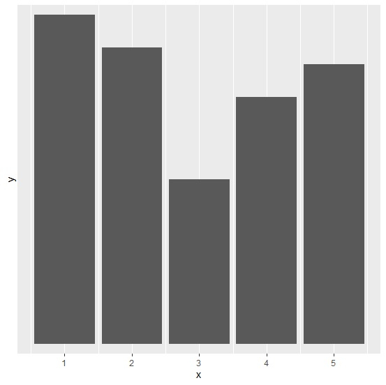
A bar graph plotted with ggplot function of ggplot2 shows horizontal and vertical gridlines. If we are interested only in the bar heights then we might prefer to remove the horizontal gridlines. In this way, we can have X-axis that helps us to look at the different categories we have in our variable of interest and get rid of the unnecessary information. This can be done by setting breaks argument to NULL in scale_y_discrete function.
Example
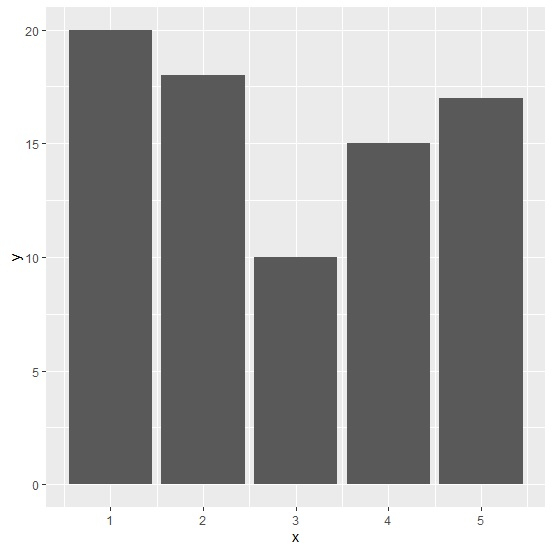
Consider the below data frame −
> x<-1:5
> y<-c(20,18,10,15,17)
> df<-data.frame(x,y)
Loading ggplot2 package −
> library(ggplot2)
Creating the plot with all gridlines −
> ggplot(df,aes(x,y))+
+ geom_bar(stat='identity')
Output
Creating the plot without horizontal gridlines −
> ggplot(df,aes(x,y))+
+ geom_bar(stat='identity')+
+ scale_y_discrete(breaks = NULL)
Output

Updated on: 2020-08-11T08:12:38+05:30
418 Views

Advertisements