
- Trending Categories
 Data Structure
 Networking
 RDBMS
RDBMS Operating System
 Java
Java MS Excel
 iOS
iOS HTML
HTML CSS
CSS Android
 Python
 C Programming
 C++
C++ C#
C# MongoDB
 MySQL
MySQL Javascript
 PHP
PHP Physics
 Chemistry
 Biology
 Mathematics
 English
 Economics
 Psychology
 Social Studies
 Fashion Studies
 Legal Studies
- Selected Reading
- UPSC IAS Exams Notes
- Developer's Best Practices
- Questions and Answers
- Effective Resume Writing
- HR Interview Questions
- Computer Glossary
- Who is Who
How to create density plot for categories filled with different colors in R?
To create density plot for categories filled with different colors, we can follow the below steps −
- Frist of all, create a data frame.
- Load ggplot2 package and creating the density plot for the categories.
- Create the density plot for the categories in the data frame by using fill function.
Create the data frame
Let's create a data frame as shown below −
x<-sample(LETTERS[1:3],20,replace=TRUE)
y<-sample(1:100,20)
df<-data.frame(x,y)
df
On executing, the above script generates the below output(this output will vary on your system due to randomization) −
  x y
1 C 19
2 A 49
3 A 94
4 C 5
5 A 45
6 A 23
7 B 33
8 A 99
9 C 73
10 A 1
11 B 84
12 A 61
13 A 7
14 C 51
15 B 43
16 B 31
17 C 67
18 C 77
19 C 50
20 B 80
Creating density plot for categories
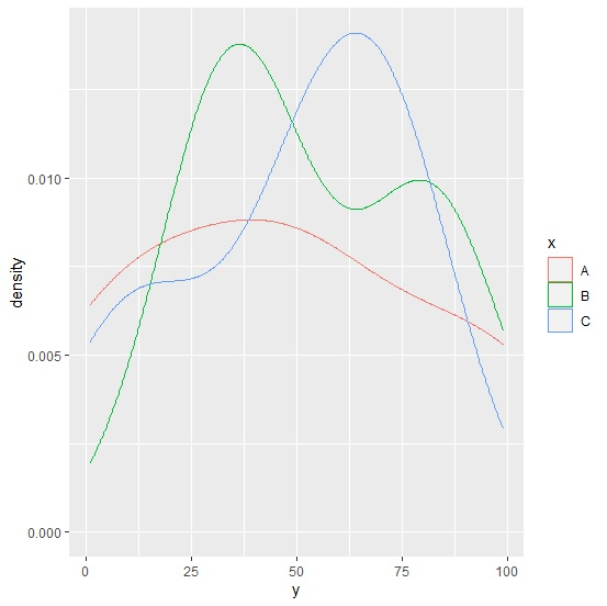
Use geom_density with col function to create the density plot for categories −
library(ggplot2)
x<-sample(LETTERS[1:3],20,replace=TRUE)
y<-sample(1:100,20)
df<-data.frame(x,y)
ggplot(df,aes(y))+geom_density(aes(col=x),alpha=0.2)
Output
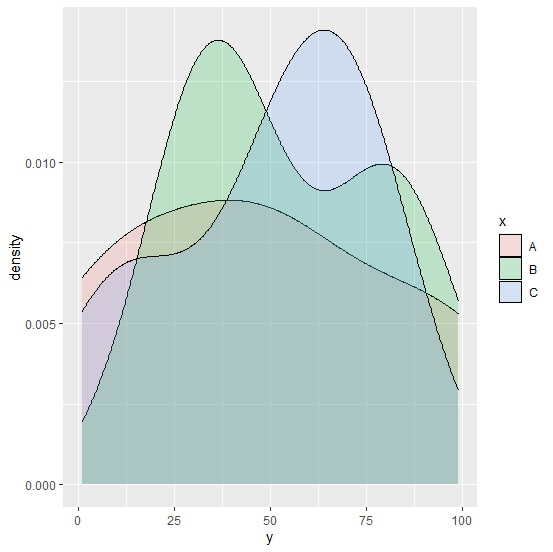
Create the density plot for the categories filled with different colors
Use geom_density with fill function to create the density plot for categories filled with different colors −
x<-sample(LETTERS[1:3],20,replace=TRUE)
y<-sample(1:100,20)
df<-data.frame(x,y)
ggplot(df,aes(y))+geom_density(aes(fill=x),alpha=0.2)
Output

Updated on: 2021-08-13T11:55:42+05:30
326 Views

Advertisements