
- Trending Categories
 Data Structure
 Networking
 RDBMS
RDBMS Operating System
 Java
Java MS Excel
 iOS
iOS HTML
HTML CSS
CSS Android
 Python
 C Programming
 C++
C++ C#
C# MongoDB
 MySQL
MySQL Javascript
 PHP
PHP Physics
 Chemistry
 Biology
 Mathematics
 English
 Economics
 Psychology
 Social Studies
 Fashion Studies
 Legal Studies
- Selected Reading
- UPSC IAS Exams Notes
- Developer's Best Practices
- Questions and Answers
- Effective Resume Writing
- HR Interview Questions
- Computer Glossary
- Who is Who
How to use column with colours to change the colour of points using ggplot2 in R?
If we have a colour column in an R data frame and we want to change the point colours in ggplot2 using that column then colour argument will be used. For example, if we have a data frame called df that contains three columns say x, y, and color then the scatterplot between x and y with the colour of points using color column can be created by using the command ggplot(df,aes(x,y))+geom_point(colour=df$color)
Example
Consider the below data frame −
> x<-rnorm(20)
> y<-rnorm(20)
> col<-sample(c("blue","red","green"),20,replace=T)
> df<-data.frame(x,y,col)
> df
Output
             x          y   col
1   1.92321342  1.2183501 green
2   0.73342537 -0.6477975 green
3  -1.00606105 -1.2697246   red
4   0.73504980 -0.5593899   red
5  -0.39976314  0.1185340 green
6  -1.15940677 -0.7219141 green
7   1.81313147 -2.1268507  blue
8  -0.47278398 -1.0414317  blue
9  -1.33914777 -0.2756125  blue
10  0.05742411  1.4000877  blue
11 -0.13134085 -0.8916141 green
12  0.87743445 -0.4291995 green
13  0.55897765  0.2815842  blue
14  0.51374603 -1.0219416  blue
15  0.27037163  0.7545370  blue
16  0.02100292  0.2674216 green
17  0.73620835  0.6262369  blue
18 -0.11391829 -0.7456059 green
19 -0.64697468  0.6713425   red
20  0.37972640  3.7717047   red
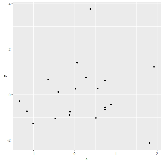
Loading ggplot2 package and creating scatterplot between x and y −
> library(ggplot2)
> ggplot(df,aes(x,y))+geom_point()
Output
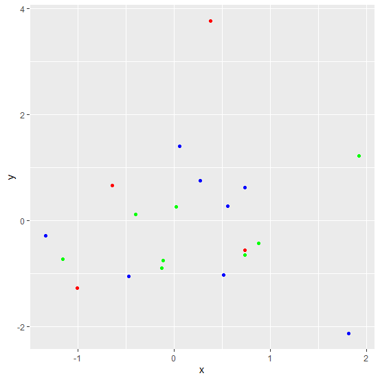
Creating the scatterplot between x and y with colour of points in col column −
> ggplot(df,aes(x,y))+geom_point(colour=df$col)
Output

Updated on: 2021-03-05T07:17:27+05:30
2K+ Views

Advertisements