
- Trending Categories
 Data Structure
 Networking
 RDBMS
RDBMS Operating System
 Java
Java MS Excel
 iOS
iOS HTML
HTML CSS
CSS Android
 Python
 C Programming
 C++
C++ C#
C# MongoDB
 MySQL
MySQL Javascript
 PHP
PHP Physics
 Chemistry
 Biology
 Mathematics
 English
 Economics
 Psychology
 Social Studies
 Fashion Studies
 Legal Studies
- Selected Reading
- UPSC IAS Exams Notes
- Developer's Best Practices
- Questions and Answers
- Effective Resume Writing
- HR Interview Questions
- Computer Glossary
- Who is Who
Set Flex Items into equal width columns with Bootstrap
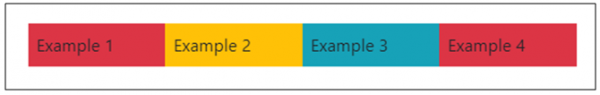
To set flex items to be of equal width column, use the flex-fill class. The class displays the items as equal width. In the below example screenshot, you can see that we have four flex items with equal width columns −
The flex-fill class is used for every flex items and in this way, we can set equal width. Below, we have two flex items −
<div class="p-2 flex-fill">
Example 1
</div>
<div class="p-2 flex-fill">
Example 2
</div>
Example
The following is an example showing how to set flex items into equal width columns using the flex-fill class −
<!DOCTYPE html>
<html lang="en">
  <head>
    <title>Bootstrap Example</title>
    <meta charset="utf-8">
    <meta name="viewport" content="width=device-width, initial-scale=1">
    <link rel="stylesheet" href="https://maxcdn.bootstrapcdn.com/bootstrap/4.1.0/css/bootstrap.min.css">
    <script src="https://ajax.googleapis.com/ajax/libs/jquery/3.3.1/jquery.min.js"></script>
    <script src="https://maxcdn.bootstrapcdn.com/bootstrap/4.1.0/js/bootstrap.min.js"></script>
  </head>
  <body>
    <div class="container mt-3">
      <p>With flex-fill</p>
      <div class="d-flex mb-3 bg-primary">
        <div class="p-2 flex-fill bg-danger">Example 1</div>
        <div class="p-2 flex-fill bg-warning">Example 2</div>
        <div class="p-2 flex-fill bg-info">Example 3</div>
        <div class="p-2 flex-fill bg-danger">Example 4</div>
      </div>
      <p>Without .flex-fill:</p>
      <div class="d-flex mb-3 bg-secondary">
        <div class="p-2 bg-danger">Example 1</div>
        <div class="p-2 bg-warning">Example 2</div>
        <div class="p-2 bg-info">Example 3</div>
        <div class="p-2 bg-warning">Example 4</div>
      </div>
     </div>
  </body>
</html>

Updated on: 2020-06-15T12:51:42+05:30
5K+ Views

Advertisements